Why Your Website Loses Clients Before They Ever Contact You
Five client builds across fitness, wellness, beauty and sports retail, and the design pattern behind sites that look fine but never convert.
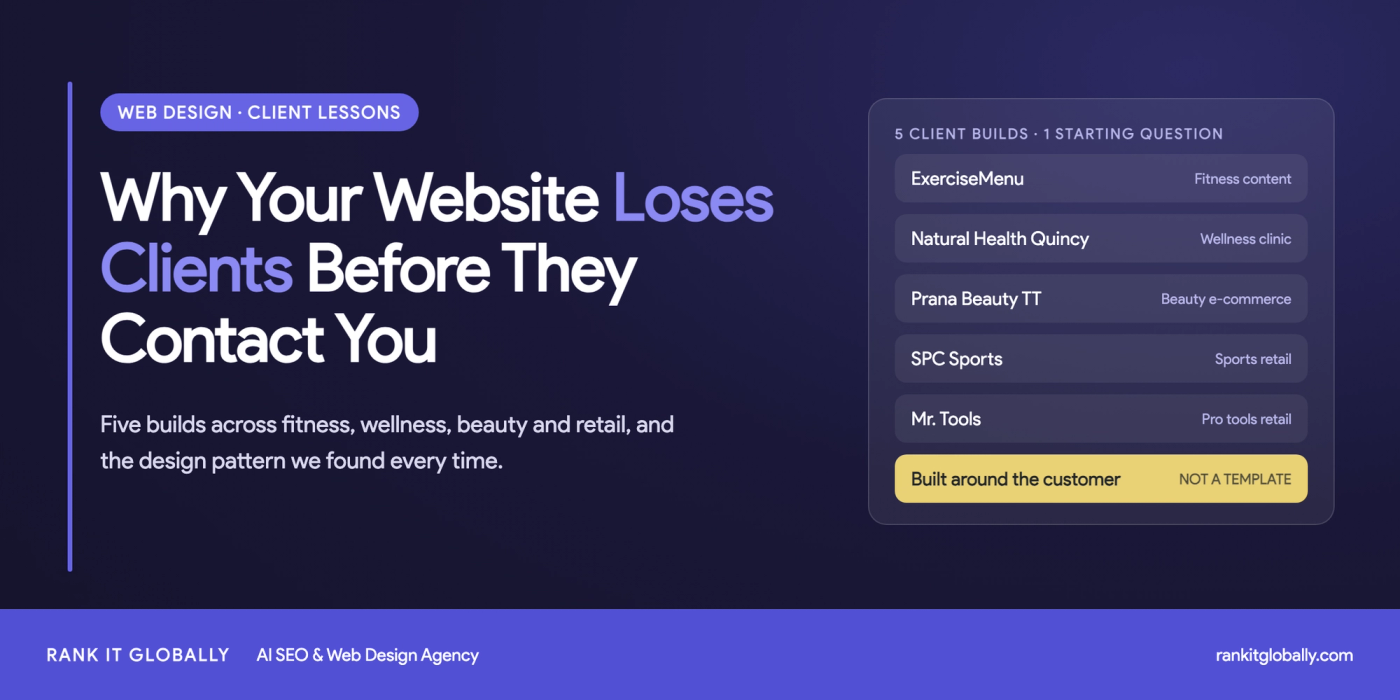
Five client builds across fitness, wellness, beauty and sports retail, and the design pattern behind sites that look fine but never convert.
When it comes to fitness website design, most businesses underestimate how much their website is costing them.
Not in hosting fees or maintenance costs — in clients who landed on the site, didn't find what they needed in the first ten seconds, and left. That gap between visitor and client is almost always a design problem, not a marketing problem.
We've built and redesigned websites for fitness, wellness, health, and sports businesses across different markets. What that work taught us isn't something you'll find in a web design checklist. It comes from sitting with each client's business, understanding who their customer actually is, and then making design decisions around that — not around what looked good in a theme preview.
Five projects in particular shaped how we think about fitness website design.
ExerciseMenu is a fitness and exercise information site. No products, no services — just content. Every visitor comes from search, which means if the site structure doesn't work for search engines, nothing else matters.
When we took on the full build, the instinct might have been to focus on making it look polished. We didn't start there. We started with the question: how does someone searching for "lower back exercises" or "how to structure a workout" actually move through this site?
That question drove every design decision. The layout was built to surface relevant content immediately, no homepage clutter, no promotional noise between the visitor and the information they searched for. Topic categories were structured the way a fitness reader thinks, not the way a site admin organizes files. Internal navigation was designed so someone reading about compound exercises could naturally find related content without hitting a dead end.
The SEO structure wasn't something we handed off to a developer after the design was done. Heading hierarchy, page speed, and content architecture were treated as design problems from the first conversation. The visual and technical layers were built together because on a content site, they're the same layer.
Key takeaway: For fitness content sites, design and SEO are the same problem. Structure that works for readers works for search engines. Build one, you get both.
Natural Health Quincy offers chiropractic care, nutritional counseling, and wellness services in Quincy, Illinois. They came to us for a redesign. The existing site had information on it — services, location, contact details — but it wasn't generating appointment requests.
The problem wasn't the information. It was the sequence.
A person looking for a chiropractor is already dealing with pain or discomfort. They're cautious. They want to know what you do, whether you're qualified, and whether other people have had a good experience, before they're ready to book anything. The old site presented a list of services to someone who hadn't yet decided they trusted the practice. It skipped steps.
The redesign rebuilt that sequence deliberately. Service sections were rewritten in plain language that explained what each treatment actually involves and who it helps, not clinical descriptions that assume the visitor already understands chiropractic care. Practitioner profiles and patient testimonials were moved to positions where they'd actually influence decisions, not parked on an About page that most visitors never open. The appointment form was integrated on service pages, right where someone who just read about treatment options would be ready to act.
The structure followed the patient's thinking, not the clinic's internal logic.
Key takeaway: Wellness and healthcare websites don't convert on aesthetics. They convert on trust signals placed in the right sequence. Design the patient journey, not just the page layout.
Prana Beauty TT sells natural beauty, skincare, haircare, body care, and wellness products in Trinidad & Tobago. The full build presented a specific challenge most e-commerce templates don't account for: the customers, the products, and the market were all highly specific, and generic e-commerce design would have made the site feel like it wasn't built for them.
The first thing we changed was how products were categorized. Most beauty e-commerce sites organize by product type, serums, creams, oils. Prana Beauty's customers don't shop that way. Someone dealing with pigmentation isn't browsing serums. They're looking for something that addresses pigmentation. We restructured the product architecture around skin concerns: acne, pigmentation, hair fall, ageing. The navigation speaks the customer's language.
The branding went through the same logic. Natural and organic positioning wasn't a badge we added to a generic layout. Ingredient callouts, cruelty-free messaging, and traditional formulation references were built into the visual design itself — because for this brand, those aren't marketing add-ons. They're the reason customers choose these products over a pharmacy shelf.
Then there were the local specifics: Trinidad & Tobago pricing, cash on delivery, local delivery offers. Small details that signal to a local customer that this site was actually built for them, not adapted from a template designed for a US or UK market.
Key takeaway: E-commerce design for wellness and beauty brands fails when it uses generic product taxonomy. Build the navigation around how your specific customer thinks about their problem, not around how your products are categorized in your inventory system.
SPC Sports is an online sporting goods retailer focused on baseball and softball equipment. This was a full build, and the customer profile made the design brief very clear: these are buyers who arrive with specific intent.
A parent shopping for a youth catcher's mitt in a particular size from a specific manufacturer isn't browsing. They know what they need. The only question is whether the site makes it easy to find and buy, or whether it makes them work for it. If it's the latter, they go to a competitor.
The product architecture was built around that reality. Categories cover bats, gloves, catcher's gear, protective equipment, and training equipment, with filters for manufacturer, color, material, and player position. Every filter exists because there's a real shopping decision behind it. Pricing, size options, and promotions were made visible at the product level, not hidden until checkout. The add-to-cart flow was kept as short and clear as possible.
For a site like this, design friction has a direct dollar cost. Every extra click a customer has to make before they can buy is a percentage of sales lost.
Key takeaway: Sports and fitness equipment sites serve customers who already know what they want. The design job is to get out of their way — fast navigation, specific filters, and a frictionless path to checkout.
Mr. Tools is a family-owned retailer selling professional-quality hand tools from established brands. Full build. The customer base is tradespeople and serious DIYers who know exactly which brands they trust and want to shop by manufacturer.
A generic product grid doesn't serve that customer. Someone looking for Knipex pliers doesn't want to browse through every tool category to find them. They want to go directly to Knipex and see the full lineup.
Brand-focused product merchandising was the organizing principle of the entire site. Categories, collections, and deals were structured around how professionals actually shop — by brand first, by tool type second. Trust signals were placed where they carry weight: customer reviews near product decisions, shipping information near checkout, support accessibility throughout. A professional spending $200 on a single tool online needs more than a good product photo. The design accounted for that buying psychology.
Key takeaway: For professional tool and equipment retailers, brand authority is the conversion driver. Design the merchandising experience around manufacturer relationships and purchasing confidence, not just product volume.
These are five different industries, five different customer types, five different business goals. The design work on each one looked completely different.
But the starting point was always the same: who is this customer, what are they trying to do, and what does this specific business need from its website?
That question — asked before any visual decisions get made — is what separates websites that work from websites that look fine but don't move the business forward.
If your fitness or wellness site isn't converting the way it should, the problem is usually upstream of the design itself. It's in the structure, the sequence, and whether the site was built around your customer or around a template.
The team at Rank It Globally works with fitness, wellness, sports, and health businesses on web design, SEO, and digital growth.
Common Questions
A good fitness website is built around how its specific customer thinks, not around a theme. Content sites need structure that serves both readers and search engines, clinics need trust signals in the right order, and stores need navigation and filters that match how buyers actually shop.
Usually it's a structure problem, not a traffic problem. Visitors who can't find what they need in the first few seconds leave. Common causes are information in the wrong order, trust signals hidden on pages nobody opens, and calls to action placed away from where people are ready to act.
Explain each treatment in plain language, show practitioner profiles and patient testimonials where people make decisions, and put the appointment form on service pages. The page should follow the patient's thinking: what you do, whether you're qualified, and whether others had a good experience.
Organize around the customer's problem rather than product type. Shoppers dealing with pigmentation or hair fall look for a solution to that concern, not a list of serums or oils, so navigation by skin and hair concerns makes products easier to find and buy.
Yes. Heading hierarchy, page speed and content architecture are design decisions. Treating them as one job from the first conversation gives you a site that works for readers and ranks in search, instead of retrofitting SEO after the design is finished.

Written by
Share

Google says SEO takes four months to a year. Here's what happens month by month, how timelines differ by industry, and how to tell if it's working.

ChatGPT now names businesses when people ask who to hire. Here's the 8-step process to make sure it can find, trust and recommend yours.

SEO gets you ranked. GEO gets you recommended. Here's how ChatGPT, Perplexity and Gemini decide which businesses to name, and the four signals you control.